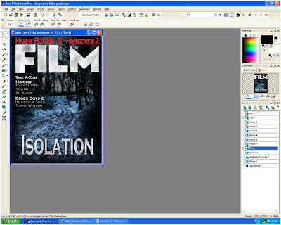
First of all I chose the picture I liked. This picture I took a while ago when it was snowing in the same area that we had filmed in. I chose this picture because i felt that it was interesting aesthetically and had a similar feel to out film.
First I changed some of the colour levels such as brightness and contrast, and gave a slight blue hue to the overrall image.I then used a black paint brush in black on a low opacity to go all around the edges of the picture to create the effect thatthe edges are closig in which is an idea that we discussed. I then createed the text for the magazine title "FILM" and the film name "ISOLATION". I made both of these very big to attract the viewer's attention to the magazine, the magazine title and film name would make someone more likely to buy the magazine as the reputation of the magazine was likely to make somebosy want to buy it, similarly someone interestedin our film wouldbuy it because they see that the main article is on it.
I then used the ersaer tool to gradually cut parts of the text out to give the impression that it was changing in tone. It also made the text look as if it had frozen over like the background that I felt worked really well. I also darkened the background to make the picture look like it was taken late in the day as most of our film is set in the night-time.
I then used the ersaer tool to gradually cut parts of the text out to give the impression that it was changing in tone. It also made the text look as if it had frozen over like the background that I felt worked really well. I also darkened the background to make the picture look like it was taken late in the day as most of our film is set in the night-time.
I put the Magazine name at the top of the page because that is what all other film magazines do on their front covers. I put the film name at the botto because aesthetically it made most sense for it to go there as it looked good and didn't cover up key elements of the photo.
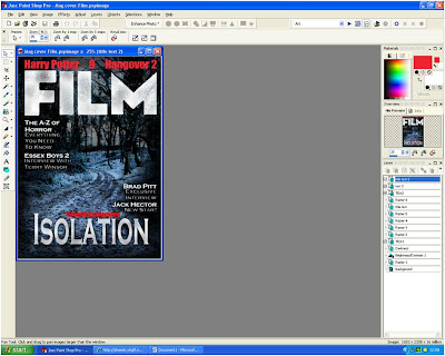
I then created text to the top of the magazine in a contrasting colour, red. This red contrasted well with the black and white so stood out really well. It also gave the effect of blood on snow which was keeping in with the theme of our film.The text at the top was "Harry Potter o 9 o Hangover 2". This text is to represent the films coming out soon that would be in this issue in the magazine.
Also I included more text on the page, just below the title. This text would also tell the onlooker what was in this issue of the magazine.For example the A-Z of horror, which gives the impression that this issue of the magazine is mainly focussing on horror films.
The text had a headline that was in bold and then below it more text that hadn't been imboldened whcih explained the story further.

Next I put more text that was similar to the above text. I also added the "World Exclusive" text just above the film name. This would make the person more likely to buy it as they find out that this is the only place that they will find out about this film. I used red again because of the resons for me using it before.

I then used the black piant tool on low opacity again to gow around the edges of the text so that the text was easily readible as the white text contrasted with the black text. I put it around all the text on the page as it made everything stand out much clearer. I also added the "Not just your usual Horror Flick!" to the bottom of the page which was designed to interest the viewer so they would buy the magazine. I did it in white but gave it a red outline that contrasted really well with black background and fit with the colour scheme so far.
I also put a bar code in the bottom left of the screen. This is on the front of all magazines as it is a vital part for retail. I put it in the bottom right cornerwhere it wouldn't stand out.
I also added the magazine website name, issue number, price and date in between the M of the film. I thought it fit nicely here as it didn't stand out but was obviously there if you where looking for it. It also aesthetically looked very pleasing here.


No comments:
Post a Comment