Wednesday, 4 May 2011
Monday, 4 April 2011
Evaluation and Feedback
In what ways does your media product use, develop or challenge forms and conventions of real media products?
When we first started to make our media product we gathered a lot of research about trailers, movie posters and magazine covers. This really helped us to establish what was expected from these productions. Also we were able to look at them and choose what we thought worked well and what didn’t work so well and thus we could put together what we wanted from our production.
For the trailer the conventions we followed a lot of standard conventions for thriller/horror trailers. The trailer starts slow and builds up into a fast paste montage of shots, this is an industry standard for making a trailer. Also at the end of the trailer after the name has come up there is an extra clip designed to intrigue and frighten the viewer even more, this is almost always used on horror trailers. Also we used the green screen at the beginning of the trailer which shows the age rating of the trailer, we felt that this would help to give our trailer more authenticity as all professionally made trailers have this. I felt that our trailer challenged conventions of most trailers by having no dialogue at all, This was a conscious decision as we felt that dialogue would have taken away from the horror of the situation. Also when we watched the trailer for the shining we were inspired by it as it has no dialogue and is only one shot, It does explain the plot at all but just tries to interest the viewer enough that they will want to see it.
When designing the poster and the magazine we again looked back to our research. For example we found that horror posters normally had one greatly edited image that would interest the viewer and so we implemented this when making our one. Also we put text at the bottom that showed; the Production Company, actors, director etc which is normally on film posters and so by us doing it looked more professional.
How effective is the combination of your main product and ancillary texts?
I feel that our main and ancillary products cohesively form a brilliant media package. The trailer, poster and magazine cover all have a very dark feel to them and all create the same sought of atmosphere and tone.
We used high contrast, slightly washed out colours when creating the film, we also used these colours when making the poster and magazine cover which helped in linking them all together to form an effective package.
When we made the poster and magazine cover we used a low opacity black brush to gradually make the edges of the photo black. This helped to give the idea that the sides of the picture are closing in on you, something that we felt linked well to our actual film.
From our audience feedback we found that all of the productions where engaging and interesting. The majority of the people we interviewed said that after seeing our complete media package they would want to see the finished film. This showed how the combination of our main product and ancillary texts where very effective.
What have you learned from your audience feedback?
We got feedback from about 15 different people, however we had problems with the sound on the camera when we interviewed the first group of people so there is only video footage of the second group.
We found that when asked the audience felt that there was stand out scenes that they thought where most effective and engaging. These where Jack swinging the baseball bat into the camera and the final ending scene where the killer opens the door and walks in as the pov shot focuses in on him. We found that these clips where a great way of making the viewer feel more engaged with the film as the point of view made it feel as if they where there. If we did it again we would probably try to put more shots like this in it.
The audience also like how well edited the film and sound where. The felt it really helped in the flow of the trailer to have the timing so well done. Also the eerie sound effects and culminating music where found to popular with our audience.
The audience couldn’t really find a least effective part of the trailer. Some said that the build up of suspense at the beginning of the trailer was perhaps too long. However others liked this as it helped to build tension and fear which is what we intended it for. Also some viewers felt that there was too many shots just of the antagonist and the protagonist separately and that they should have interacted with each other more. We felt that this was a valid point and looking back we felt that we should have included more scenes like this.
How did you use media technologies in the construction and research, planning and evaluation stages?
Filming
When we filmed we used a Sony full HD 1080p camera. This camera used SD memory as the original camera that we used DV tape and broke whilst filming. Therefore we used a different camera that used a different memory system. The use of these cameras has taught me a lot about different types of storage device.
To research we used the internet a lot. We looked at websites lime IMBD and YouTube. We used IMBD to look at films we liked and find films that we would analyze. We used YouTube to look at and research previous trailers. This is a good example of web 2.0 interactivity.
We used Google Maps and Google Street View to help us find the locations that we would be using for our film. However with mine and Jack’s knowledge of the local area we already had some filming locations that we planned to use before we started planning.
Editing
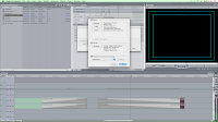
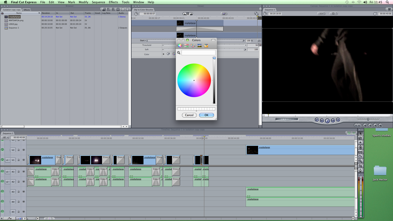
To edit we used final cut express. Prior to our project I had no experience with final cut but now I am fully familiar with the tools that it offers. I learnt how to manage clips, audio and overlaying very well thanks to the use of Final Cut. Also I learnt a lot about exporting settings and hot to upload a video to YouTube.
Blogging
To blog we used BlogSpot. Managing a blog is not new experience for me but I have learnt a new thing or two about BlogSpot. Especially when my blog was removed and I had to desperately try to rescue it.
I learnt how to imbed videos and images and how to neatly set out a blog so that a viewer can easily understand what is going on.
Ancillary tasks
To create my ancillary task I used paint shop pro. I am already very familiar with paint shop pro but there is always more to learn. Paint shop pro is especially useful because of the use of layers and the amount of effects that a user can do which are vital for a film poster or magazine cover.
Saturday, 26 March 2011
Evaluation of Mag Cover
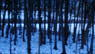
Overall I am very pleased with what I have created for the magazine cover. I feel aesthetically it look really good and has a very high level of polish to it. Everything I wanted to put into it was in their and it worked together very well. The only drawbacks I could think of was that the photo was of snow when there was no snow in our actual film but I felt that the picture was just too good not to use, also the same feel was created was created by this image as the film so it was still very appropriate. Overall I felt that this was an extremely stong piece of work.
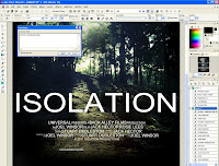
Creating the Magazine Cover

First of all I chose the picture I liked. This picture I took a while ago when it was snowing in the same area that we had filmed in. I chose this picture because i felt that it was interesting aesthetically and had a similar feel to out film.

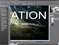
First I changed some of the colour levels such as brightness and contrast, and gave a slight blue hue to the overrall image.I then used a black paint brush in black on a low opacity to go all around the edges of the picture to create the effect thatthe edges are closig in which is an idea that we discussed. I then createed the text for the magazine title "FILM" and the film name "ISOLATION". I made both of these very big to attract the viewer's attention to the magazine, the magazine title and film name would make someone more likely to buy the magazine as the reputation of the magazine was likely to make somebosy want to buy it, similarly someone interestedin our film wouldbuy it because they see that the main article is on it.
I then used the ersaer tool to gradually cut parts of the text out to give the impression that it was changing in tone. It also made the text look as if it had frozen over like the background that I felt worked really well. I also darkened the background to make the picture look like it was taken late in the day as most of our film is set in the night-time.
I then used the ersaer tool to gradually cut parts of the text out to give the impression that it was changing in tone. It also made the text look as if it had frozen over like the background that I felt worked really well. I also darkened the background to make the picture look like it was taken late in the day as most of our film is set in the night-time.
I put the Magazine name at the top of the page because that is what all other film magazines do on their front covers. I put the film name at the botto because aesthetically it made most sense for it to go there as it looked good and didn't cover up key elements of the photo.

I then created text to the top of the magazine in a contrasting colour, red. This red contrasted well with the black and white so stood out really well. It also gave the effect of blood on snow which was keeping in with the theme of our film.The text at the top was "Harry Potter o 9 o Hangover 2". This text is to represent the films coming out soon that would be in this issue in the magazine.
Also I included more text on the page, just below the title. This text would also tell the onlooker what was in this issue of the magazine.For example the A-Z of horror, which gives the impression that this issue of the magazine is mainly focussing on horror films.
The text had a headline that was in bold and then below it more text that hadn't been imboldened whcih explained the story further.

Next I put more text that was similar to the above text. I also added the "World Exclusive" text just above the film name. This would make the person more likely to buy it as they find out that this is the only place that they will find out about this film. I used red again because of the resons for me using it before.

I then used the black piant tool on low opacity again to gow around the edges of the text so that the text was easily readible as the white text contrasted with the black text. I put it around all the text on the page as it made everything stand out much clearer. I also added the "Not just your usual Horror Flick!" to the bottom of the page which was designed to interest the viewer so they would buy the magazine. I did it in white but gave it a red outline that contrasted really well with black background and fit with the colour scheme so far.
I also put a bar code in the bottom left of the screen. This is on the front of all magazines as it is a vital part for retail. I put it in the bottom right cornerwhere it wouldn't stand out.
I also added the magazine website name, issue number, price and date in between the M of the film. I thought it fit nicely here as it didn't stand out but was obviously there if you where looking for it. It also aesthetically looked very pleasing here.
Tuesday, 22 March 2011
Access Denied
My access to my previous blog has been blocked for reasons unknown to myself. So I had to start a ew one here instead. I was able to cpy and paste all the previous blog entries onto this page.
The Big Blog
Sunday, 13 March 2011
Post Production
Music
Jack Sent a letter to the owner of the music that we used that read:
"Dear Music Distributor,
I am writing to request use of one of your music files. I am representing 3 media students, who are creating a movie trailer for our coursework and after listening through one of your particular tracks, we felt it would be perfect for our movie trailer.
This trailer will not be distributed to audiences, and will in no way make a profit, so we are just asking for the use of it for copyright purposes.
Yours Sincerely
Jack Hector"
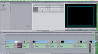
Editing
Stuart was incharge of edting of the film. However a Director I was present overseeing the editing, contributing ideas aswell as making sure the editing worked cohesively together and ran smoothly. Jack got all of the sound and music that we needed for the film.
We used Final Cut Express to edit our movie, alternatively we had access to iMovie but we felt iMovie did not have enough advanced functions at hand for us to use to create as high quality project that we hoped for. Final Cut also allowed us to be able to export the movie file in different ways and sizes.
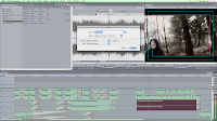
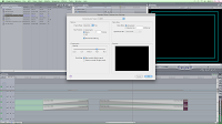
We changed the canvas size to cater for the HD video we had recorded. To do this you press ctrl+c on the canvas, then make it 1080p size. One drawback of this is that it increased render time however we will have a better final result and give us less limitation when we finally export it.
We had an issue with directly inporting the clips into Final Cut. What we did to get around this was to import the footage into iMovie then exporting it to the desktop. Then we copiend the clips into my resources on Final Cut.
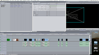
First we cut all the clips that we didn't want and imported the sounds that we ould be using.
We created a saturated effect with a deep blue hue for later use. The logo we had created for Back Alley Productions and Isolation on Paint Shop Pro we copied onto the timeline.

We started with the two pieces of text that would be in the trailer. We used sound accents when the test came up which focuesed the viewers attention and made it so the text moved slighlty.
There was a very interesting clip we had filmed of the antagonist walking towards the car. In this clip the headlights turned on and off, as he walked closer. My idea was that we should edit the trailer so that between the flashes of light we had other parts of the film. This helped to balance the trailer and gave an interesting effect as the story is gradually revealed. Stuart came up with an interesting light ray effect which enhanced these clips.
Jack was able to obtain a compilation track of different movie trailer songs. We listened to all of them carefully before selecting the one that we felt was most approriate for the film. It was slightly too long for what we wanted it for, so we had to cut it down a bit.


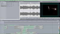
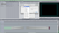
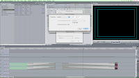
Using the internet we looked up what exporting settings would give us the best quality for our project. We exported using QuickTime Conversion, then made the format a QuickTime Movie file as opposed to an AVI or mpeg-4. Then we changed the compression type to PNG which is the best for exporting in HD, then made it export with millions of colours. Because our file wasn't a DV file, we had to make the size just "current" which we found was 720 x 404 pixels which we then de-interlaced. For the sound, we just made it the best quality possible, as a lot of the trailer was very sound orientated. I then un-checked the link to make it ready for internet streaming as this compresses the file which lowers the quality.

We used Final Cut Express to edit our movie, alternatively we had access to iMovie but we felt iMovie did not have enough advanced functions at hand for us to use to create as high quality project that we hoped for. Final Cut also allowed us to be able to export the movie file in different ways and sizes.
We changed the canvas size to cater for the HD video we had recorded. To do this you press ctrl+c on the canvas, then make it 1080p size. One drawback of this is that it increased render time however we will have a better final result and give us less limitation when we finally export it.
We had an issue with directly inporting the clips into Final Cut. What we did to get around this was to import the footage into iMovie then exporting it to the desktop. Then we copiend the clips into my resources on Final Cut.
First we cut all the clips that we didn't want and imported the sounds that we ould be using.

We created a saturated effect with a deep blue hue for later use. The logo we had created for Back Alley Productions and Isolation on Paint Shop Pro we copied onto the timeline.
We started with the two pieces of text that would be in the trailer. We used sound accents when the test came up which focuesed the viewers attention and made it so the text moved slighlty.

There was a very interesting clip we had filmed of the antagonist walking towards the car. In this clip the headlights turned on and off, as he walked closer. My idea was that we should edit the trailer so that between the flashes of light we had other parts of the film. This helped to balance the trailer and gave an interesting effect as the story is gradually revealed. Stuart came up with an interesting light ray effect which enhanced these clips.
Jack was able to obtain a compilation track of different movie trailer songs. We listened to all of them carefully before selecting the one that we felt was most approriate for the film. It was slightly too long for what we wanted it for, so we had to cut it down a bit.


Using the internet we looked up what exporting settings would give us the best quality for our project. We exported using QuickTime Conversion, then made the format a QuickTime Movie file as opposed to an AVI or mpeg-4. Then we changed the compression type to PNG which is the best for exporting in HD, then made it export with millions of colours. Because our file wasn't a DV file, we had to make the size just "current" which we found was 720 x 404 pixels which we then de-interlaced. For the sound, we just made it the best quality possible, as a lot of the trailer was very sound orientated. I then un-checked the link to make it ready for internet streaming as this compresses the file which lowers the quality.
Filming for the Second Time
Our original tape that we filmed on experienced technical difficulties adn we could not play it properly. It skipped around and lost sound. This was extremely frustrating considering how long we took to do it. I tried taking the camera and tape to a repair shop but theey couldn't do anything about it.
Because of the compications we had to film again. Originally we had used a Sony mini tape but his time we used a different camera that uses solid state memory, which is far more reliable than the tape. The camera we used is called a Sony HDR-XR155.
On the second time we filmed we where unable to get a second car so we had to change the plot to get around this. The antagonist attacks them on foot and from the front this time. Although filming again was tedious we where able to do more shots and techniques as well we where able to do it much quicker this time as we where far more experienced.
Creating The Poster
We had to make a poster which would accompany our film. Stuart was the one of our group who was most familiar with desing software such as photoshop so he made it while I contributed ideas and advice. We went out into Canford Heath and took a range of different pictures. We decided that we would use a picture of the sun beaming through some trees for our final poster.

Then, using Paint Shop Pro 8, me and Stuart began to edit the photo.


Then Stuart used the paint tool to Darken all around the edges of the photo which made the viewer to look centrally at the image. It also created a sense that the edges where closing in which we felt fitted well with our film. Also by darkening the image it looked a lot more forboding.

From our Research we had found that the cast, producer, editor, director, distributor and production company were all featured in small writing at the bottom of the poster. Stuart did this in White and cleverly darkened the background further around the text so it was easier to read. Also Stuart added our the logos of the production companies and distribution companies.
.

Then, using Paint Shop Pro 8, me and Stuart began to edit the photo.

First we changed the colour, contrast and brightness to overall enhance the picture to get it to look like what we wanted.

Then Stuart used the paint tool to Darken all around the edges of the photo which made the viewer to look centrally at the image. It also created a sense that the edges where closing in which we felt fitted well with our film. Also by darkening the image it looked a lot more forboding.

From our Research we had found that the cast, producer, editor, director, distributor and production company were all featured in small writing at the bottom of the poster. Stuart did this in White and cleverly darkened the background further around the text so it was easier to read. Also Stuart added our the logos of the production companies and distribution companies.
.


Actual Filming
We finally got round to do our filming when the weather was more generous. We used my camera to film and transported all the equipment to the location using my car.
Equipment that we used:
Sony XR-155 camera
Tripod
White card to reflect light
Kodak HD pocket camera
Torches
I was the directorof the film, this meant I had to make sure everybody else knew what they where doing and when to do it aswell as organizing everything, I also had to find the location and make sure that the continuity between shots was kept. Jack was in charge of lighting, I showed him how we could use the torches and card to create softer reflections of light to better give the impression of natural light, and helped find the location to film. Stuart was mainly cameraman although I did film some shots, he was incharge of the camera and the various shots that we used.
Instead of using the Tripods that we bought for our film we held the camera wihth our hands. We felt this meant we could get better angles (e.g. we couldnt get the tripod open in the car), also we felt the shakiness helped to add to the disorientation and dramatized events.
We filmed each shot multiple times so we could look afterwards using hindsight and decide which was best for the production, and we also did each scene from different angles, so when editing the film we could cut between shots which we felt would make the film look more profeshionally done aswell as allowing the viewer to see what is taking place on screen far easier.
To get light ont he scene we either used a very high powered LED torch, the headlights from my car, natural light(Moon) or a slightly less powerful yellow tinted bulb torch. We felt that we dealt with the lack of light very well in the final piece. Shooting in the dark is always a huge problem even for films with huge budget and considering we didn't have a budget we did extremely well. At one point we did discuss using night on day but we felt it would retract from the realism of the piece as most people can spot it.
Whilst filming we kept to the original plot that we had planned for. When on set however complications meant we had to change some sections and new ideas came up which meant we shot scenes that we didn't initially plan for.
Ther postponing of filming
Unfortunately, due to the weather of snow and ice, our filming had to be postponed until better conditions. So weused this extra time to slightly edit the plot of the film and develop the characters, we also got our equipment together and ready for when we wanted to film.
The location


The location I found was just outside Swanage in an area called rempstone which is located in Dorset. This meant that the loocation was close to our houses and we could easily get their and back with all of the equipment that we needed.
The location selected was extremely important as it had to strongly show the isolation of the main charecters. This are was perfect as it was filled with tiny country roads wiht no streetlighting or other vehicles present. We did most of our filming on one quite stretch of road as we felt it was the most appropriate location. The road was extremely isolated and had trees all around to which we felt established some sense of entrapment. As there was very little light at the location and we where doing our filming at night we had to either use torches or the moon for lighting.
Saturday, 12 March 2011
Pictures of Location
I went to our possible location for shooting the film and took some photos for reference. This helped the others to know what the place was actually like.


0 comments 
Mother - Bye! Have a safe trip.
Grace - (Said sarcastically) Yeah yeah ...
Grace and Jayden carry their bags to the car. They then drive from the house down the road, Grace looks embarassed by her worried mother.
Grace - We're going to be late you know ...
Jayden - Don't worry about it, I know a short cut.
Jayden then turns the car into a dark road through the woodland, Grace looks fed up and tired.
The car then begins to break down
Jayden - No no no no ahhh.
Jayden then leaves the car and checks under the bonnet
Jayden - I just need to get some oil
Jayden then runs off to the nearest petrol station
Grace - This better not take long! (Woodland sound effects begin, gradual diminuendo before car pulls up behind )
Grace looks up, to see car in rear view mirror pull up behind
Breathing rate increase (Foley sound) Dialogue is unused until the end of the trailer, apart from girl screams/wails Grace wakes up in room, looks up to see man standing in doorway
Blake: Remember me?
Saturday, 12 March 2011
Looking at film magazine covers
I began by researching lots of different film based magazines. Some of the magazines I looked at are:


 The front cover of a magazine is crucial to the success of a publication. It is used to draw in possible customers who may buy the magazine. The magazine usually implements a number of ways of getting a viewer's attention and interesting them enought to get them to purchase the magazine. These are:
- Total Film
- Empire


- Usually a famous star or iconic image is used. For example Tom Cruise above or the face and importantly eyes of the terminator above that. This is a great way of getting the viewer to look at the magazine.
- The name of the magaizine is normally very large and can either be placed in the foreground or background. It is placed in the background if the main image needs to be placed over the top of it to give it more dominance. The title of a magazine is used to get the viewer to recognize the magazine and so they would buy it because of it's good reputation or because they liked it last time they bought it. Also the title helps to reassure the customer that the magazine is dedicated to film.
- Lots of smaller text is used to further intrigue the reader. This text normally outlines some of the interesting stories inside the magazine. These help to interest the reader so increase the likelihood that a magazine will sell.
Research on trailers
We watched and studied a number of trailers to better understand how they where constructed. We noted how the editing, sound, mise en scene and camera shots and movements where implemented when making a trailer.
Most trailers gradually build towards some sought of conclusion. usually the begging of a trailer is used to establish the story, location charecters and events that may take place during the film. This part of the film is usually slow paced and has some quite music in the background to move the trailer along smoothly. The trailer gradually builds and usually eventually culminates into a classic montage of action(either dialogue or phsical action on screen) this part is normally edited together so each frame is very short and is in time with the music which by this point has gotten much faster and louder. This section slightly disorientates the viewer as they are not quite sure what is happening which leads to the viewer wanting to know more, which they can do by watching the film.
This is an alternative idea for a trailer which I found very interesting. This trailer has no intention of trying to establish a plot or charecters it simply intends to intrigue the viewer so much that they are willing to split with money just to know just what the hell is going on.
Friday, 28 January 2011
Creating the Plot
We wrote a script that would go with our film. The helped us to decide what audio we would need to record and how much of it we would need to do. We will record the audio using an hd voice recorder.
Grace - (Said sarcastically) Yeah yeah ...
Grace and Jayden carry their bags to the car. They then drive from the house down the road, Grace looks embarassed by her worried mother.
Grace - We're going to be late you know ...
Jayden - Don't worry about it, I know a short cut.
Jayden then turns the car into a dark road through the woodland, Grace looks fed up and tired.
The car then begins to break down
Jayden - No no no no ahhh.
Jayden then leaves the car and checks under the bonnet
Jayden - I just need to get some oil
Jayden then runs off to the nearest petrol station
Grace - This better not take long! (Woodland sound effects begin, gradual diminuendo before car pulls up behind )
Grace looks up, to see car in rear view mirror pull up behind
Breathing rate increase (Foley sound) Dialogue is unused until the end of the trailer, apart from girl screams/wails Grace wakes up in room, looks up to see man standing in doorway
Blake: Remember me?
Naming The Charecters and Film
We are now beginning to discuss names for the film and the characters in the film, at first we thought that leaving them un-named may make the film apply to more people as they would feel more sceptic as they could believe that it could happen to them. However we felt the need for names is a necessitie in the film. For the boyfriend we decided on the name - Jayden Harrison and for the female role - Grace Ryan. We felt that murderer needs a name because during the film you will not recognize him as the murderer because you dont know what happens til the end. This tactic is commonly used to show distinction between plot and story. His name is Blake Young.
Choosing a name was probably the hardest job we have had to do so far. We needed something catchy, short and interesting. Some examples of names we had decided were, Revenge, Silent Footsteps, Homocide, Isolation and Woods. Somw of these names we felt were to common and maybe did not link in with entity of the film however we discussed further more and have come up with the name 'Isolation: The Blake Young Story'.
Choosing a name was probably the hardest job we have had to do so far. We needed something catchy, short and interesting. Some examples of names we had decided were, Revenge, Silent Footsteps, Homocide, Isolation and Woods. Somw of these names we felt were to common and maybe did not link in with entity of the film however we discussed further more and have come up with the name 'Isolation: The Blake Young Story'.
Friday, 14 January 2011
StoryBoard
Today we drew a storyboard. This helped us to plan out how we would go about framing the shots and the action that would take place in each one. Ot also allowed us to visualize the scenes and find potential problems before they occur. Me and Stuart created the storyboard on an A3 piece of paper.

Our storyboard provides a visual layout of events as they are to be seen through the camera lens and shows the sequence in which the shots will be seen by the viewer. The storyboard helped us to all contribute various ideas about shots, lighting, actions and how we would develop the story.
We had to create a story board so we all knew exactly what would be happening. We went over various camera angles in detail, and practiced filming in our own time to make them perfect for the final piece. We also became more familiar with the editing software that we would be using (Final Cut Express).
We also looked at a variety of different camera movements and techniques. These included the dutch tilts, tracking and panning shots. These shots all create suspense and disorientate the viewer which are key elements in any successful horror.
Thursday, 9 December 2010
Preliminary Work
Before we went about making our final piece that we would sumbit we made a number of preliminary pieces. These where a variety of short films which where mainly horror based. We made one which was similar to the blair witch project, one which was based on alien and there where others aswell. To increase our knowledge of making a thriller we made a series of films. These films helped us to better understand the use of camera angles, camera movement, camera shots, sound, mise-en-scene, and the use of editing.
To film them we used a full 1080p camera and did the post production using Final Cut Express or iMovie.
On one project we made a blair witch style thriller. The story was very similar to Blair Witch, three media students go missing and their footage is found. We filmed with a hand held flip style camera. The shakiness and poor quality helped to reinforce the realism and disorintates the viewer. The film began slow and tension was gradually built up, through the use of dialogue and suspense sound effects, and culminated in a fast paced finale where the footage was quickly cut to create panic and to increase the speed of the sequence.
Friday, 19 November 2010
Looking at different media used to advertise films
I began by looking at different media used to advertise films within the genres of thriller and horror. A vast array of media is used to advertise and present the final product to the intended audience. They aim to capture the viewer’s attention and to intrigue them enough that they are willing to part with money to see the finished article.
First I focused on the posters. I found the main idea was to give the viewer a stimulating glimpse at the film. The posters’ dark atmospheric nature aimed to inspire some sort of emotion in the viewer, be it fear, suspense, shock or disgust. There is usually a statement about the film to stimulate the viewer leaving them wanting to know more. This statement usually contrasts the colour scheme of the page so it stands out. These posters usually implement a bold striking title that captures the viewer’s attention.


First I focused on the posters. I found the main idea was to give the viewer a stimulating glimpse at the film. The posters’ dark atmospheric nature aimed to inspire some sort of emotion in the viewer, be it fear, suspense, shock or disgust. There is usually a statement about the film to stimulate the viewer leaving them wanting to know more. This statement usually contrasts the colour scheme of the page so it stands out. These posters usually implement a bold striking title that captures the viewer’s attention.

Here is an example of a typical poster for a thriller. The ghostly nature of the film is created through the darkness and use of monotone. The tag line “Before you die, you see [the ring]” grabs the viewers attention, it sticks it the viewer’s head as they wonder what is the ring? And what is the eerie circle of light? The unsophisticated handwriting used for “the ring” make the viewer think of a child. They ask what is an innocent child’s writing doing on a horror film poster . The ambiguity of the poster leaves the viewer in the dark in that the poster doesn’t give anything away in terms of the plot. The viewer understands the film will either be a horror/thriller as all the parts come together.
These are some more posters that I looked at:


Friday, 19 November 2010
What Genre?
We had a long discussion as to what possibilities each genre would offer us as a group. We decided upon a thriller/horror, we felt this genre suited our group best as we are all fans of this type of film. I like these types of films because of the emotions that they create, the nail biting tension and suspense that a good thriller creates and the shock and terror that a high quality horror generates.
A2 Coursework Introduction
For my A2 advanced portfolio I am working in a group of three with Jack Hector and Stuart Duddlestone. In a group we discussed the multiple brief options we had to choose from and how we felt about taking each one. We decided on:
A promotion package for a new film, to include a teaser trailer, together with two of the following three options:
A website homepage for the film;
A film magazine front cover, featuring the film;
A poster for the film.
We chose this option because we are all very passionate about film and we have good access to the filming equipment and editing software that we need. I find it an exciting prospect to be able to create a well constructed and intelligent teaser trailer.
Subscribe to:
Comments (Atom)